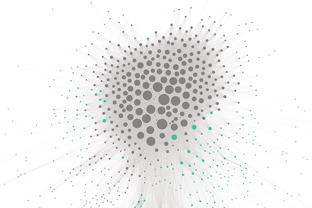
For centuries we’ve been using graphs and charts to enhance information and data. Recently, this old practice has got a modern makeover, with data visualisation now a vital key for communicating insights and tracking behaviours.
Dr. Kristen Sosulski is an expert in the data visualisation field. An Associate Professor of Information, Operations and Management Sciences at New York University’s Stern School of Business and the Director for the NYU Stern Learning Science Lab, she consults and leads workshops on data visualisation techniques and best practices.
Kristen has a new book out, Data Visualisation Made Simple: Insights Into Becoming Visual, which you can pre-order here.
Here she gives the lowdown on how you can use data visualisation to get the most out of your employees, help enhance your business and communicate more effectively with your audience.

I equip and train executives to mine and use visualise data. My area lays at the intersection of what I call business analytics and learning science. I design digital platforms, I analyse those analytics and visualise those results.
Visualisation is a process of creating data graphics to tell a story, and communicate insights with information. Translating data into information means we can level the playing field and allow for a better and clear comprehensive of the message. I have three ways of describing it: transforming data into information, communicating insights and, lastly, but not least, providing evidence.
Visualisation’s been around since William Playfair in the late 1700s. He invented the line graph and the bar graph, so it’s been a tool used a lot in statistics and economics. Edward Tufte really popularised the idea of using information graphics in one’s practice. I’ve been involved in this ever since I was at business school – the idea of always having to sell a message. Being able to really sell my idea or message always came with not just showing a pretty picture, but having a picture that says something backed up by data.
I think visualisation is now an interface that allows us to understand the world; anything from your smartphone to your smart cities. It’s really been a way to allow us to navigate, explore and synthesise simple and complex data.
Charts and graphs are the currency in which PowerPoint exists, so we’re used to showing some information and some numbers in graphic form. But they don’t always hit the mark and the way I describe it in my book is ‘putting the extra 20% in’ to ensure you can really see the value of the proposition one is making.
Using visualisation to help grow your business starts with the information access, and then you have to change the culture of your organisation to encourage information sharing – that’s the foundation of this. You have to make sure you have that data access across the various departments, from marketing to operations, to be able to use that data effectively.
I would say visualisation applies to all industries. It’s really agnostic. Some people describe it as a tool, but I like saying it’s a process. It’s a process in creating a new way of communicating, and in any field you need to communicate and use data that is applicable.
For example, let’s take an HR consulting company. They would work with other businesses and organisations to answer questions such as ‘how are we paying our employees in relation to market rates?’. If you imagine a large corporation with, say, 4000 employees, it involves access to broader market data, nuanced things like employee seniority, job functions and other variables. So as an HR company, I could show you a spreadsheet of numbers, or I could show you a visual interface that easily presents to you and your 4000 employees those which are within the pay-grade range and those that are outside the range. It will also show you where we need to make some adjustments. So it signals an action one can take.
Another example is a big brand digital strategy firm who might be questioning what the value of mobile is and their clients’ digital strategy. We know mobile is really important and we need to know where customers convert: they fill their shopping cart online in one place, but are they converting using that same technology? It seems like a straightforward question, but you have to understand the linkages of behaviour. So, as a customer, I fill my shopping cart up online on my lunch hour on my desktop, and then on my commute home I’m going to convert and checkout on my mobile device. So showing those pathways visually to a client that mobile is a really important part of their digital strategy is critical – you can say it, but actually showing the percentage of how many people convert on mobile is such a clearer way of showcasing that call to action.
I think visualisation is now an interface that allows us to understand the world; anything from your smartphone to your smart cities
You need to know your audience. That’s classic. You have to figure out what I call the party favour – the takeaway you get from a party that helps you remember the occasion. So in this field, the party favour is the one thing that will make your audience remember your message and take action.
An audience could be people in the boardroom, it could be somebody you’re trying to convince at lunch next to you. Once you get to the point of having a message, you have to make sure your audience isn’t working too hard to interpret what you show them. It has to be presented in a way in which the insights are apparent immediately.
I talk about 10 standards in my book to improve readability, accessibility and clarity. I’ll give you a couple: Use colour to highlight rather than decorate. You don’t want to highlight all data points, just highlight the point that might be a last-quarter sale, for example. Also, readability: you don’t want to be showing something at 14-point font. Everything has to be readable, including the axes. And you really want to make sure that you explain what you show – you want to take the time to explain; tell people what the axes are and guide them through it.
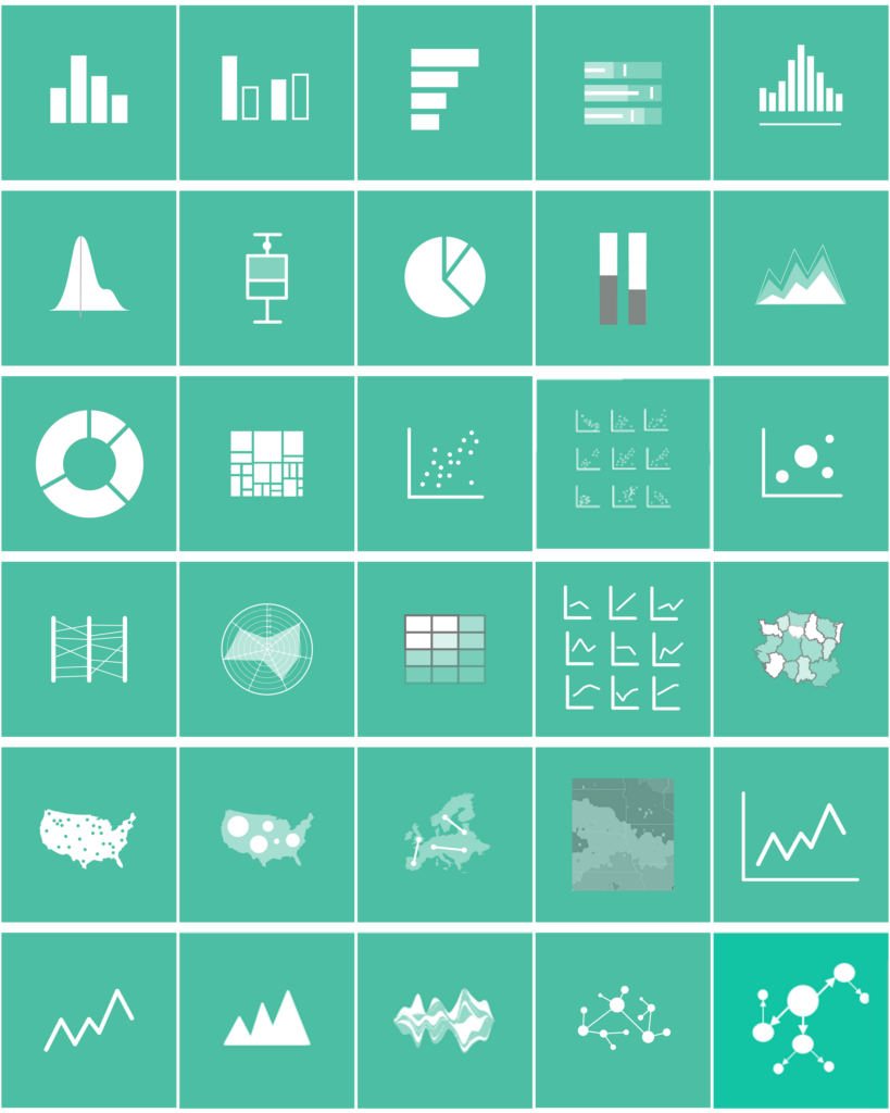
There are four categories of tools to create visualisations. Your first category is your basic productivity applications – Excel, Google – basic stuff that most people have access to. Then you have your visualisation tools that experts are using, like Tableux or ArcGIS or ClickView. These are platforms specifically for visualisation. Then you have business intelligence tools that executives might already have, like Microsoft Power BI or IBM Watson Analytics in which you are using visualisations to make decisions based on types of machine learning algorithms and statistical analyses. And finally there are programming-based packages – you’re starting with the data and manipulating that data using a series of models, and the output is the result of which model performed best, and you’d have a visualisation showing that. You can do that in Python, in R, or maybe even JavaScript.
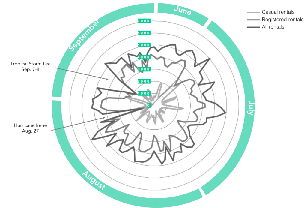
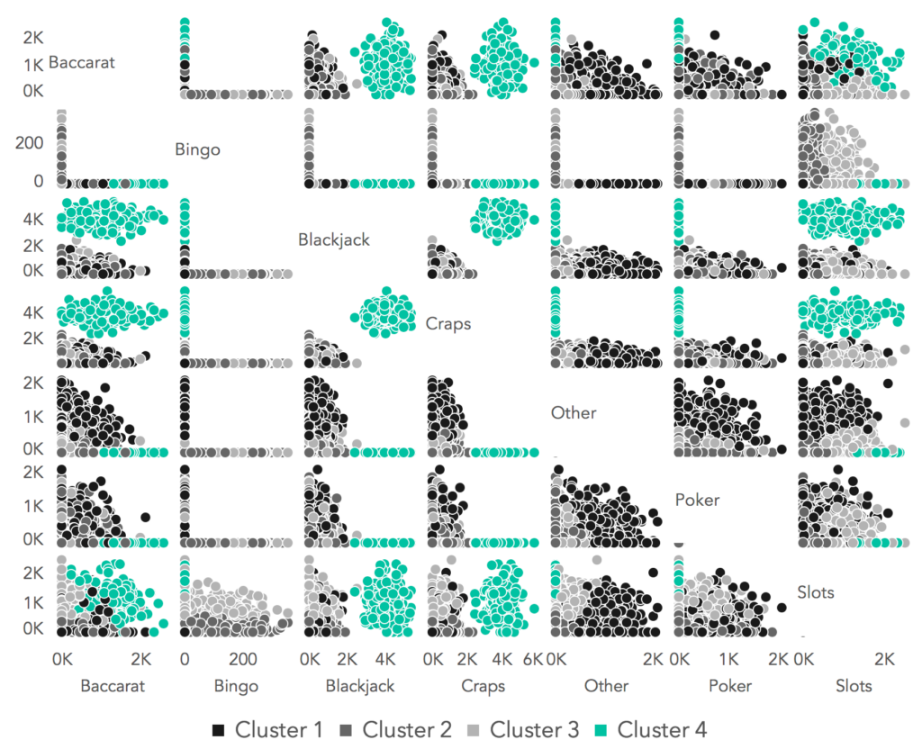
I always say use the tools that work best in your workflow. For example, you might want to show a map of London with all of the wireless hotspots. Well, Excel isn’t going to do that so you’ll need to upgrade to a Tableux or an ArcGIS.
It’s such a fast-moving field, and there are two major trends we are already seeing. One is storytelling. I’m frequently asked to give a workshop on how to tell stories with visualisation – using data as evidence and how you use that to create a compelling narrative, including drama and conflict to create a story.
The second trend is interactive data graphics. You can almost think of this as user-driven storytelling, where you add to the story. You have your own inputs; you can even see this when you log into investment accounts. You’re given pie charts and bar charts, but things are going to be more sophisticated in terms of showing predictive paths or alternative paths for how you can invest and make decisions on finances, for example.
There is definitely less resistance to visualisation now. People are beginning to really understand the benefits. I’ve had executives come back to me and say ‘I’ve hired a whole visualisations team!’
